
(Else, bury it)

As market researchers, data is our stock in trade. We spend our days thinking about how to collect data, how to analyze it, how to interpret it and how to report it. Data is what we do and we hate to discard any piece of information once we have gone through the trouble of collecting it. However, does this really meet the fundamental goal of market research, which is to reduce uncertainty and improve decision making? Or, as Marie Kondo might have it, does this data spark joy? Unfortunately, the answer is that it often does not. While there are many reasons for this, including the tendency to throw everything but the kitchen sink into a survey, as an analyst I would like to focus on a few analytical missteps that can be easily avoided and that improve the quality of the results and spark insight, if not outright joy.
Market landscaping studies are a prime example of data gathering run amok and nowhere is it more apparent than in the product perceptions section. Here, respondents are asked to evaluate the performance of products in their choice set across large numbers of attributes. These data are then presented in myriad ways – key driver analysis, perceptual maps, snake plots, bubble charts and on and on. At its core, the user of this research is asked to absorb product differences on twenty or more product attributes – at best, this results in confusion, at worst it leads to outright errors in interpretation. An example of this is the Correspondence Map which many users interpret wrongly by relating products to specific attributes based on their proximity. Correspondence maps represent a two-dimensional representation of multi-dimensional information and the axes represent the underlying dimensions (or components) measured by the individual attributes. The correct interpretation is therefore based on locating brands with respect to these dimensions, not their proximity to attributes. This misperception can be easily remedied if we give up our deep-rooted to reporting every single piece of data used in generating the map. An example makes this clear. The perceptual maps shown below are based on respondents’ association of various vehicle concepts to personality attributes. Figure 1 shows the traditional way of displaying a correspondence map. This map, apart from being visually incoherent is subject to misinterpretation by those who would associate concepts with their proximity to specific attributes.
Figure 1: Correspondence Map of Vehicle Concept Associations to Personality Attributes
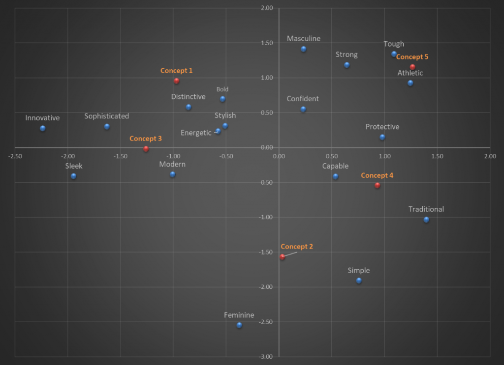
Figure 2 shows a map that captures the locations of the concepts relative to the axes, but now the axes have been defined based on the output of the correspondence analysis. The horizontal axis clearly captures the “traditional-to-modern” continuum whereas the vertical axis captures a “feminine-to-masculine” continuum. This makes it easy to see that both Concept 1 and Concept 5 are viewed as tough and masculine, but the former is also perceived as modern and innovative whereas the latter is perceived as traditional. This clarity is lost in the map on figure 1. I don’t know about you, but the map in figure 2 sparks joy in me, the one in figure 1 does not!
Figure 2: Simplified Correspondence Map of Vehicle Concept Associations to Personality Attributes
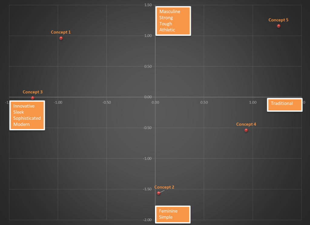
The key takeaway here is that if a datapoint adds nothing to our understanding, or worse clouds it, it is ok to leave it out!
This idea is relevant throughout the research process – from design through reporting. I am often asked by clients as to the number of attributes that can be tested in a conjoint/choice exercise. Leaving aside issues of design efficiency, balance and orthogonality for a given sample, the question ignores the bigger issue, which is that standard full-profile conjoint was never intended to handle 12 or 15 attributes! There is ample research that shows respondents get overwhelmed when presented with multiple product profiles defined on more than 6-8 attributes and resort to task simplification strategies that yield biased responses. It is incumbent on the researcher to question whether it is necessary to vary all these attributes in the design. If the answer truly is yes, then by all means test them using alternative approaches that can handle large numbers of attributes such as partial-profile designs or an adaptive self-explicated model[1]. If not, go back to the drawing board and question the need for every single attribute. Again, the default position should be simplicity.
So, how does one achieve simplicity in design? Here are some key factors:
- Leverage existing knowledge: Previous primary research, secondary data sources, in-house expertise; all of these are valid sources of information that can be leveraged to simplify the current task. Some questions don’t need to be asked every single time – this is particularly true of data that will be used in aggregate, i.e. at the sample level
- Wear your respondent’s shoes: Oft-repeated but seldom followed, design your survey with the clear awareness that real, live humans are going to be taking it. Their well-being matters, not only because they are your potential customers but because useful data comes from unruffled respondents and useless data from agitated ones
- Ensure your data are not open to misinterpretation: As the correspondence map example illustrates, analysts can take simple steps to ensure that analytic output are not subject to misinterpretation, especially once it is shared with a wider audience. If a chart cannot be interpreted without a voice over, it probably needs to be re-done
- Be open to alternative methodologies: There is always more than one way to skin the proverbial cat. Some methods result in tasks that are very hard from the respondent’s perspective, others not so much. Yes, you can use the same off-the-shelf software to estimate the same model project after project, but we are living in an era of freely available information that is unmatched in the history of mankind. There are huge communities of R and Python users who are happy to share their knowledge on practically every topic (and then some) – tap into these incredible reservoirs of experience and expertise. Bottom-line, there is always a better way to do something and the choice of method should balance analytic rigor with simplicity in implementation
Marie Kondo’s maxim to keep only those things that spark joy is simply a restatement of a fundamental truth expressed by philosophers through millennia. A relatively modern expression “identify the essential, eliminate the rest”, attributed to the Zen blogger Leo Babauta is, I think, related to the same idea. This is a philosophy that should be easy for market researchers to practice. Data analysis by its very nature aims for a Zen-like simplicity by paring away a mass of information to reveal the truth within – we just need to remind ourselves of this fundamental truth every time we work on a project.
[1] Adaptive Self-Explication of Multi-attribute Preferences, Oded Netzer, V. Seenu Srinivasan, Journal of Marketing Research. February 2011, Vol. 48, Issue 1, Pages 140-156