
Two Lenses on the Same Data: What Chart Audits Can — and Can’t — Tell Us
Chart audits have this way of feeling more “real” than other data sources — you’re looking at actual patient records, after all — but the structure underneath them tells a different story. Once you pay attention to how these studies are built, you start to see that they behave a lot more like cluster samples than simple patient samples, and that has real consequences for how we interpret them. The goal isn’t to make chart audits look weaker or claims data look stronger; it’s to understand the mechanics behind each so we’re not surprised when two reasonable methods give us two different views of the same market.
Chart audits are cluster samples — even when we don't call them that
In most primary patient record studies, we don't sample patients directly. We sample HCPs, and each HCP contributes a small cluster of patients — usually three to seven. That structure has real consequences:
The unit of sampling is the HCP
The unit of analysis is the patient
Those patients are not independent of each other
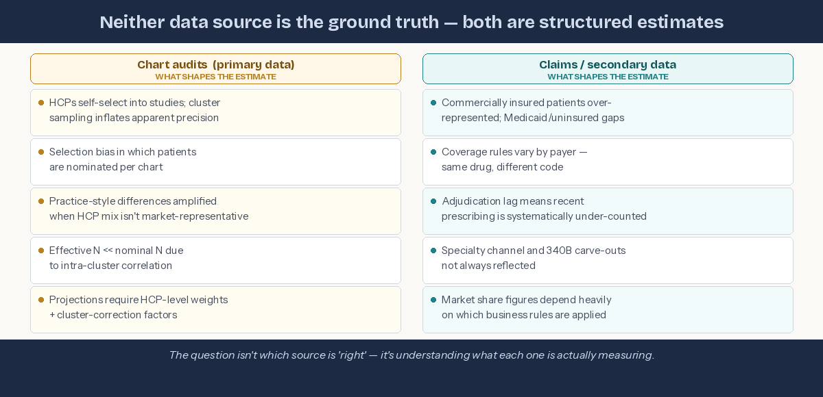
Patients from the same practice share diagnostic habits, treatment preferences, coding patterns, and access constraints. Five patients from one HCP do not give you five times the information. The effective sample size sits much closer to the number of HCPs than the number of patient records.
HCPs influence which patients get selected — more than we often realize
Even when instructions say "take the next five consecutive patients," real-world behavior varies. Some HCPs subconsciously favor interesting cases. Others gravitate toward patients who reflect their typical practice, or their aspirational practice. This introduces selection bias even in well-run audits.
Prospective, consecutive selection reduces this bias — but slows data collection and increases operational burden. Most studies land on a hybrid approach, which is practical but not perfect.
Claims data isn't the yardstick either
It's tempting to treat claims-based market share as the objective benchmark against which chart-audit data is judged. But claims data comes with its own structural limitations:
Commercially insured patients are over-represented; Medicaid and uninsured populations often appear incompletely
Coverage and adjudication rules vary by payer — the same drug can be coded differently across systems
Adjudication lag means recent prescribing is systematically under-counted at any given pull date
Specialty channel and 340B carve-outs aren't always consistently reflected
Market share figures from claims depend heavily on which business rules are applied to the data — and those rules involve judgement calls
When chart-audit shares diverge from claims-based shares, the instinct is often to treat claims as correct and chart audits as biased. The more accurate framing: they're answering different questions with different structural assumptions, and neither has a monopoly on truth.
Neither source is the benchmark — both carry design assumptions that shape the estimate.
Why this matters for decision-makers: If your brand team uses chart-audit data to set share targets and claims data to evaluate performance against them, you may be comparing two estimates that are each shaped by different structural assumptions. The gap between them isn't necessarily signal — it may be a design artefact. Understanding both sources is a commercial decision, not just a methodological one.
The right way to think about chart-audit data
Chart audits are genuinely valuable — they deliver clinical richness that claims data simply cannot provide. But they are best understood as:
A structured view of how sampled HCPs manage the types of patients they chose to present.
Not as:
A direct projection of market-level treatment share.
To project to the market responsibly, you need to:
Weight at the HCP level, not the patient level
Adjust for cluster effects
Understand how selection behavior shapes the patient mix
Treat chart audits as practice-style samples, not population samples
When you do that, chart audits become powerful and reliable — just not in the naïve "n patients = n independent observations" way they're often interpreted.
The bottom line
Chart audits feel concrete because they're based on real patients. But structurally, they behave like cluster samples — and ignoring that leads to overconfidence and difficult conversations with clients.
Equally, claims data feels authoritative because it's transactional. But it reflects the patients who were insured, the codes that were submitted, and the rules that were applied at the time of the pull. It is an estimate too.
The goal isn't to find which source is right. It's to understand what each one is actually measuring — and to triangulate accordingly.